Fintech landing page for ZerOk
Landing page for ZerOk, a virtual dollar card you top up with crypto and spend anywhere in the world. One page in English, and the card itself is issued in a Telegram bot. This isn't a screenshot: scroll and click right here.

Scroll the laptop screen and tap the menu and buttons. It's a mini copy: the menu scrolls to the sections, and “Get Card” shows that Telegram comes next. The real bot doesn't open from here.
TaskWhat the site had to do
Make the card crystal clear in a single scroll
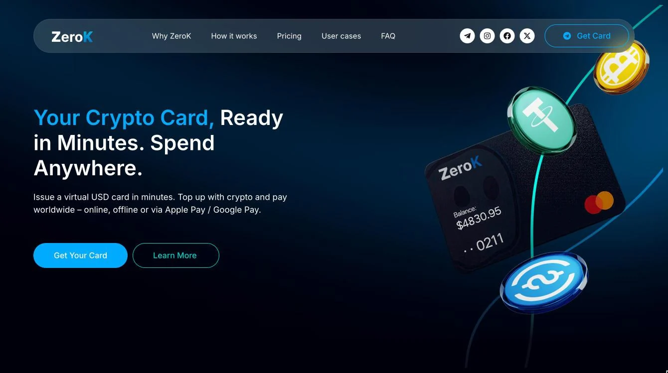
Your Crypto Card, Ready in Minutes. Spend Anywhere.
The card isn't issued on the website but in a Telegram bot. So the page had to explain the product, show prices honestly and lead people to the button.
ProcessSeven steps to launch
Design doesn't come first
First I figure out what we're building: changes on a wireframe are quick and cheap, on a finished design they aren't.
-
01
Brief
I ask about the product, the customers and the page's goals. ZerOk is a card for individuals and businesses. It's issued in Telegram, so the page only explains and leads on.
Who does what
- You: tell me about the product and customers.
- Me: ask questions until the picture is clear.
- Result: written answers and page goals.
- What's the product?
- A virtual dollar card topped up with crypto
- Who is it for?
- For individuals and businesses
- Where is the card issued?
- In a Telegram bot, in three steps
- What should the visitor do?
- Tap the button and go to the bot
-
02
Specification
A list of exactly what I build: page sections, plans, buttons. That way nobody has to guess what was meant.
Who does what
- You: read and approve.
- Me: write down everything we decided.
- Result: a list of sections and buttons.
- Format
- one page, the menu leads to its sections
- Sections
- benefits, three steps, two cards, pricing, use cases, FAQ
- Plans
- Free Card and Premium Card, compared in one table
- Buttons
- “Get Card” and “Start in Telegram” lead to the Telegram bot that issues the card
- Language
- English
- Platform
- WordPress
-
03
Structure
I map the order of sections and the visitor's path to the button. You can see what people learn first, what comes next and where they switch to the bot.
Who does what
- You: check that the path makes sense for your customers.
- Me: build a map of all sections.
- Result: a page structure diagram.
How the fintech landing page is built
One page, 7 sections, 5 menu items. Section names stayed in English as on the site, each with an explanation below.
01First screenheadline, two buttons, a card with coins02Why ZeroKwhat makes the card different: swipeable benefits03How it workshow it works: three steps and a “Start in Telegram” button04Free Card and Premium Cardtwo cards side by side, each with its own button05Pricingpricing: a 7-row table and a “Get Your Card” button06Use Caseswhat the card is for: 6 use cases for people and businesses07FAQ8 questions, the answer opens on tapEnd pointTelegram botthis is where the visitor gets the card. The “Get Card” and “Start in Telegram” buttons lead hereThe diagram is recreated from the finished page: sections appear in the same order as on the site.
-
04
Wireframe
A black-and-white layout of the page, without colour or images.
Why: we agree on the order of sections while changes are quick and cheap, and nobody gets distracted by visuals.
Who does what
- You: approve the logic and order of sections.
- Me: draw it screen by screen.
- Result: an approved page layout.
Black-and-white wireframe of the first screen
To be honest: this wireframe was drawn from the finished first screen to show the principle.
-
05
Design
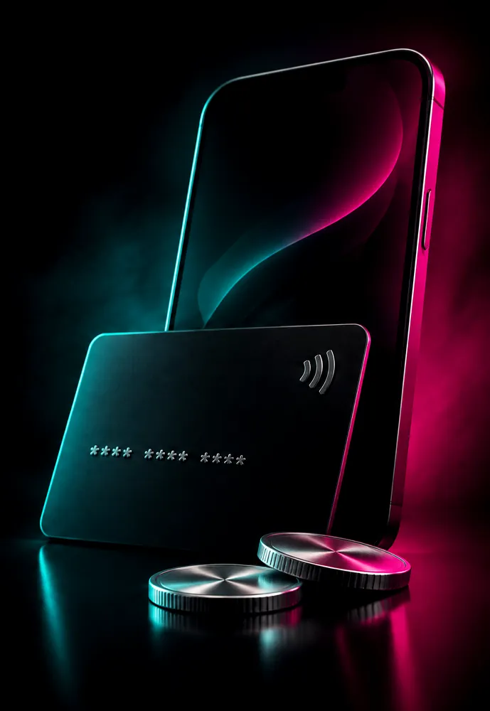
The style goes onto the approved layout: a deep blue background, light blue and turquoise for key elements, a 3D card and coins on the first screen. The client already had the card. I drew the coins, scenes and animations around it myself.
Who does what
- You: look at the style and approve it.
- Me: design mockups for desktop and mobile.
- Result: ready mockups for both versions.
Design idea
Crypto
Three 3D coins: gold, green and blue. They're used to top up the card.
#E8CD0C#6BC8BD#2689C4
USDCard
The client's card: black, tilted, showing a dollar balance. It works for payments all over the world.
#0D101F#1C1E2B#115191
Your Crypto Card, Ready in Minutes. Spend Anywhere.
The card sets the deep blue background, the coins bring light blue and turquoise for key elements. On the first screen the coins and the card sit together.
#011E39#00AAFF#3BC3C3
How it looks on the page
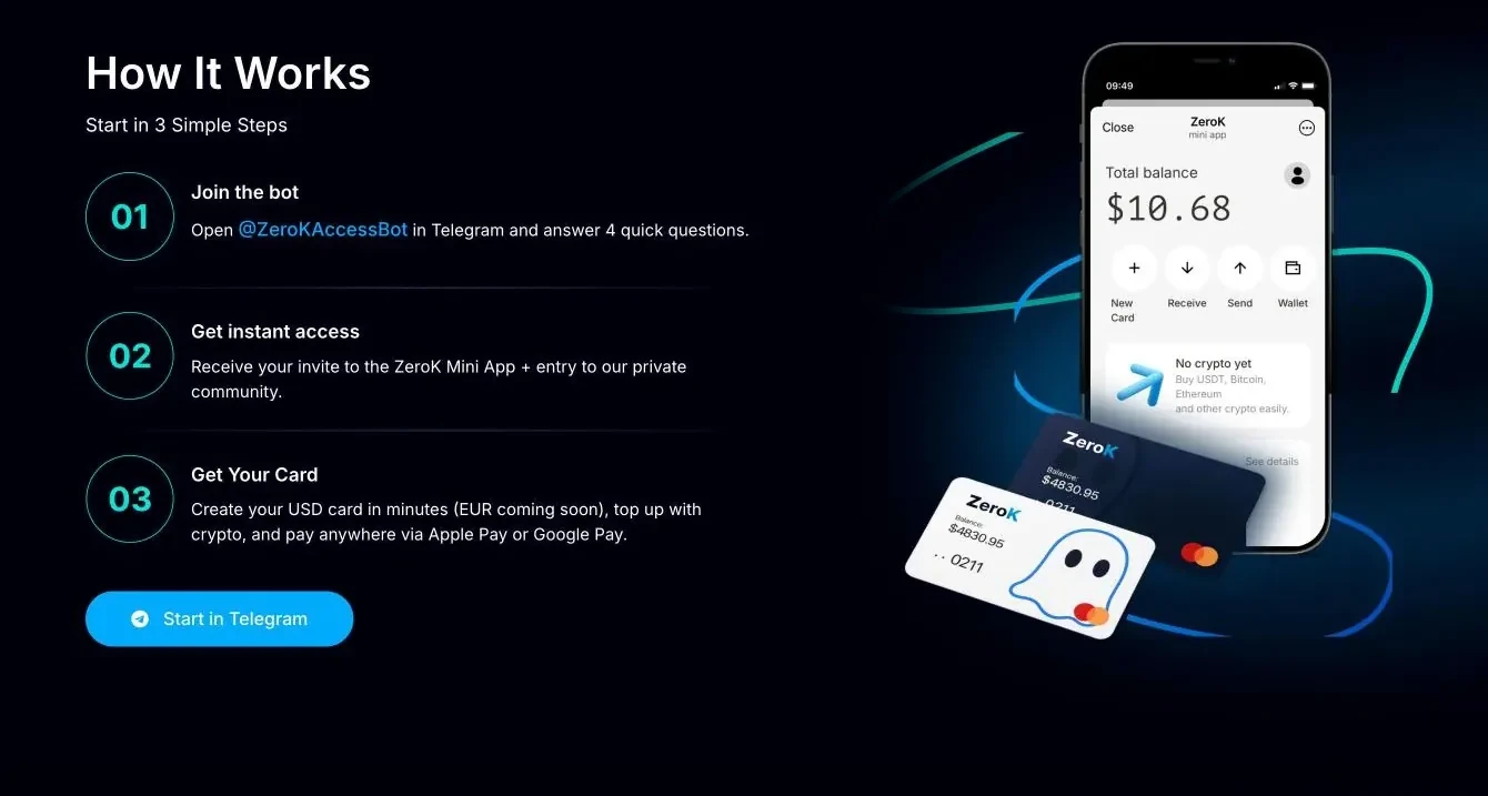
![“How It Works” section on the ZerOk site: three steps and a phone with the app]()
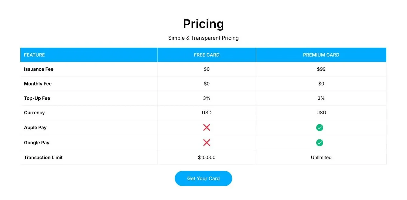
![Pricing table on the ZerOk site: seven rows, Free Card and Premium Card columns]()
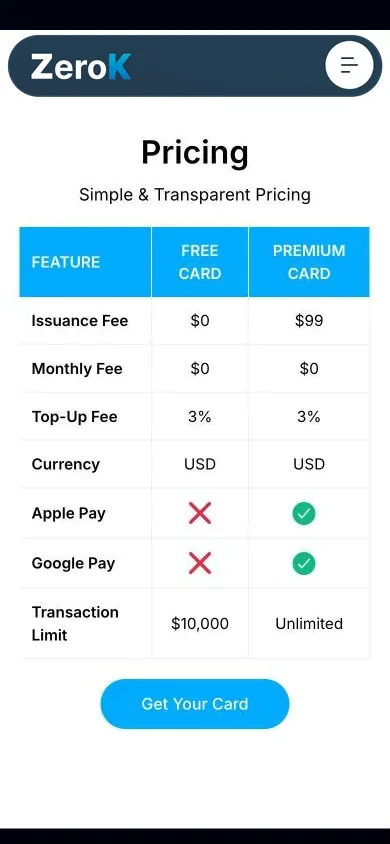
![ZerOk pricing table on a phone]()
![ZerOk three-step section on a phone]()
Three steps ![Free Card and Premium Card on a phone]()
Two cards ![ZerOk pricing table on a phone]()
Pricing table ![ZerOk FAQ on a phone]()
FAQ -
06
Build
Only now do I build the page on WordPress in Elementor (a builder where it's easy to edit a site without a developer) from the mockup. Telegram buttons, the pricing table and the FAQ are already inside.
Who does what
- You: get a link to the working version and see how everything looks.
- Me: build all sections, the pricing table and the FAQ, and connect the buttons to the Telegram bot.
- Result: a working page that sends people to the bot.
![Three-step section on the finished ZerOk page]()
- 3steps
- 2plans
- 8questions
-
07
Testing and launch
I test on desktop and mobile and tap every button. Launch only after that.
Who does what
- You: review the result and give the go-ahead.
- Me: check every section and every button.
- Result: a live page.
- On desktop
- On mobile
- Every section and every button
- Jump to the Telegram bot
- Launch
SolutionWhat's inside
From the button straight to Telegram
The visitor taps “Get Card”
Lands in Telegram
Three steps to the card
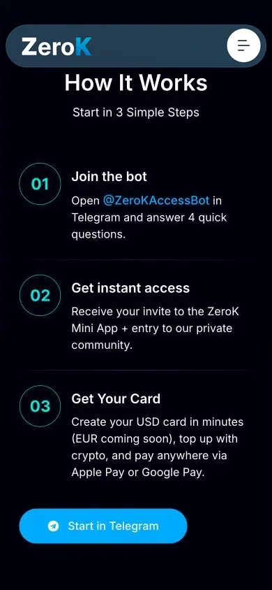
The “How it works” section has three numbered steps and a “Start in Telegram” button. You see right away what happens after the tap.
- Numbers in circles
- “Start in Telegram” button
- Phone with the app
Plans side by side
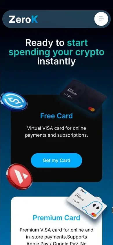
Free Card and Premium Card sit side by side, each with its own button. Below, all prices are collected in one table: conditions on the left, plans next to them.
- 7-row table
- Cross and check mark
- Button under the table
- Use cases for people and businesses
- Six situations around the phone: from everyday shopping to business payments. Everyone recognises their own.
- FAQ
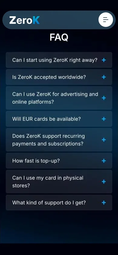
- Eight questions in a collapsed list. The answer opens on tap, so the page doesn't stretch.
AnimationsWhat moves on the site
Animations that lead to the button
I made two Lottie animations for the ZerOk site. They're not decoration: they show how the card lives in your phone. Each starts when its section appears on screen and then loops.
-
How it works
The phone comes alive
Next to the three steps, purchases appear on the screen: a hotel, coffee, a card top-up. Even before the “Start in Telegram” button you can see what your account will look like.
-
User cases
Coins around the phone
USDT and Bitcoin coins fly out of the phone as circles ripple around it. The main point is clear at once: the card is topped up with crypto. Around it are six use cases, from shopping to business payments.
Swipe sideways to see the second animation.
Benefits carouselCards in the benefits section scroll on their own every 5 seconds. When you hover, the carousel pauses so you can finish reading.
FAQAnswers expand smoothly on tap, and buttons change colour on hover. The motion is light and doesn't distract from the button.
Three versionsPhone, tablet and desktop
Adapted to every device
A separate mobile version: everything in one column, big buttons, each easy to reach with a thumb. The tablet has its own grid, halfway between phone and desktop.
- Two buttons on the first screen are stacked, with the card and coins below them
- Benefits swipe with a finger, one card at a time
- The pricing table with three columns fits the screen, no sideways scrolling

This is how the page looks on a phone. Scroll the screen and tap «Get Your Card»: you'll see that Telegram comes next. The pricing table fits in full.


Need a website for your business too?
Tell me about your project. I'll start with a conversation, not with design, just like here.