Website for LeaderShip, a private school and kindergarten in Kyiv
Website for LeaderShip, a private school and kindergarten in Kyiv: school campuses in Obolon and Vynohradar, a kindergarten in Novi Petrivtsi, plus day and away camps. This isn't a screenshot: scroll and click right here.

Scroll the laptop screen and tap the menu and buttons. This is a mini copy: four pages out of twelve, forms don't send.
TaskWhat the website had to do
So parents find the answer before they ask
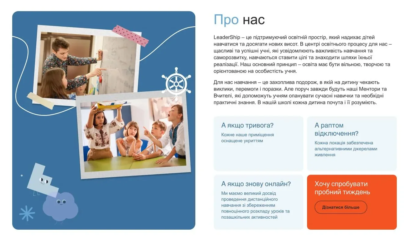
What about air-raid alerts? Every one of our buildings has a shelter.
Parents come for different things: school, kindergarten or camp. The site had to route them to the right area straight away, ease their main worries and lead them to an enquiry.
ProcessSeven steps to launch
Design doesn't come first
First I figure out what we're building, because changes on a diagram are quick and cheap, but on a finished design they aren't.
-
01
Brief
I ask about the school, the parents and the website's goals. LeaderShip has a school, a kindergarten and camps in three locations. Each area has its own parents and its own questions.
Who does what
- You: tell me about the school and the parents.
- Me: ask questions until the picture is clear.
- Deliverable: written answers and website goals.
- What kind of school?
- A private school and kindergarten, plus camps
- Where are you based?
- Kyiv: Obolon and Vynohradar. Novi Petrivtsi. Away camps in the Carpathians
- Which areas?
- School for grades 1–11, kindergarten, day camp and away camps
- What should a visitor do?
- Book a visit or ask a question
-
02
Specification
This is the list of exactly what I build: pages, areas, form, contact options. That way nobody has to guess what was meant.
Who does what
- You: read and confirm.
- Me: write down everything we decided.
- Deliverable: a list of pages, areas and contact options.
- Pages
- home, about, school, kindergarten, opportunities with electives and day camp, camps, events, careers, contacts
- Areas
- school, kindergarten and camps, each with its own card on the homepage
- Form
- “Talk to us”: name, phone, email and question
- Quick contact
- “Contact us” button, phone, Telegram, Viber, email
- News
- with dates, the latest ones visible on the homepage
- Platform
- WordPress
-
03
Structure
I draw the sitemap and the parents' path to an enquiry. You can see where people come from and where they leave a request.
Who does what
- You: check that the path makes sense for your parents.
- Me: map out every page.
- Deliverable: a site structure diagram.
How a kindergarten and school website is structured
12 pages including the blog and events. How to read the diagram: a card is a separate page, a line with an arrow is a section on the same page.
Homefrom here, three areas: school, kindergarten, campsAbouthistory, mission, values, a word from the co-founders- History
- Mission and values
- Eventsnews section: cards with dates
- Careersthree vacancies, description expands+ CV with the application
Schoolgrades 1–11: teaching approach, locations, reviewsKindergartenwhat makes the kindergarten special and activities for childrenOpportunitiesnine electives and camps- Electives
- Day camp
- Campsin the menu as “Away camps”: sessions with dates
Contactsthree addresses with opening hours and a mapTalk to ussits on every page, and buttons across the site open it in a pop-upon “Careers” you can attach a CV to the applicationOutside the menuEvent posts and camp sessionsseparate pages, opened from the “Learn more” buttonPrivacy policylinked in the footer and under the formTo be honest: this diagram was recreated from the finished site.
-
04
Wireframe
This is a black-and-white layout of every page, with no colour or photos.
Why: we agree on the order of blocks while changes are quick and cheap, and nobody gets distracted by looks.
Who does what
- You: approve the logic and block order.
- Me: draw screen after screen.
- Deliverable: approved page layouts.
Black-and-white layout of the first screen
To be honest: this layout was drawn from the finished first screen to show the principle.
-
05
Design
The style goes on top of the approved layout: a light blue background, one orange button, real photos of children and characters I drew myself.
Who does what
- You: review the style and approve it.
- Me: design mockups for desktop and mobile.
- Deliverable: finished mockups for both versions.
Design idea
![LeaderShip, a space for happy children]()
School brand
A logo with a sailboat and a nautical name. Deep blue and light blue.
#182B60#3B719F#63A4D5
![Three illustrated characters from the LeaderShip website]()
My illustrations
I drew the characters and the nautical details myself: a lighthouse, a ship's wheel, a life ring. Soft pastel colours.
#ABB5EA#ADDAE6#C7DAE3
Private school and kindergarten LeaderShip
![]()
![]()
![]()
The school's blue in the headline, my characters next to the text and one orange button on a light background.
#3B719F#ADDAE6#F45323
How it looks on the site's pages
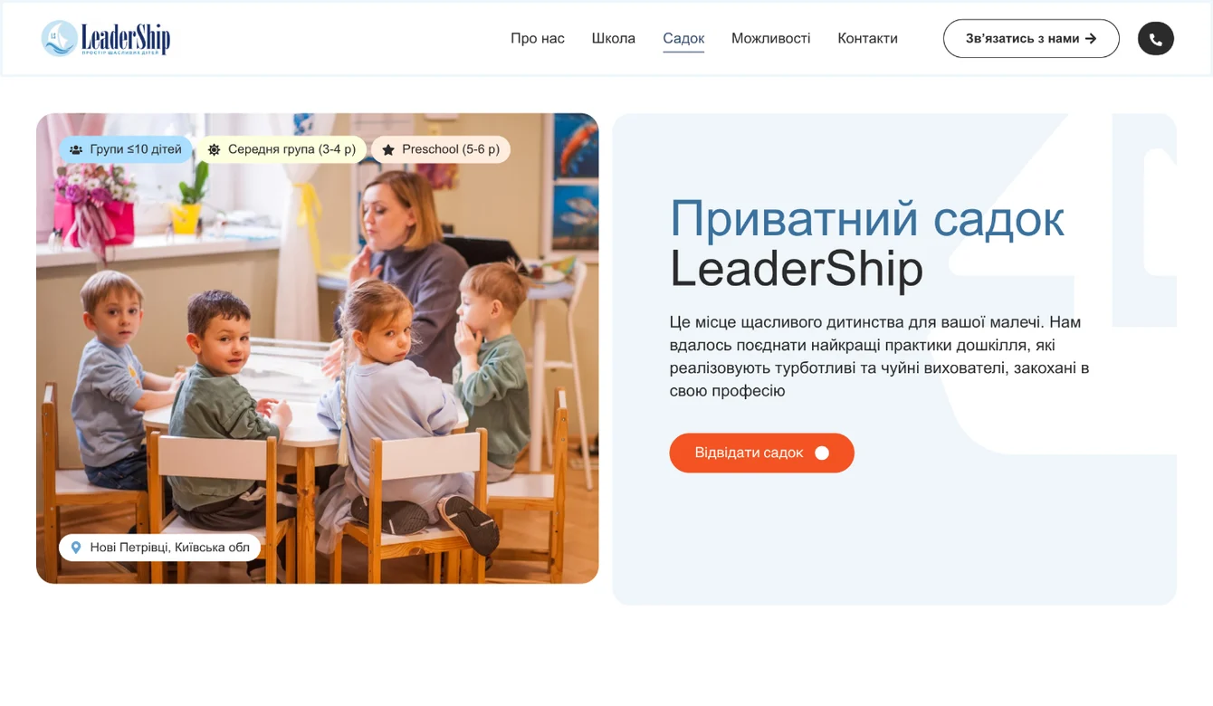
![First screen of the Kindergarten page on the LeaderShip website: photo with group and location tags, blue headline and orange button]()
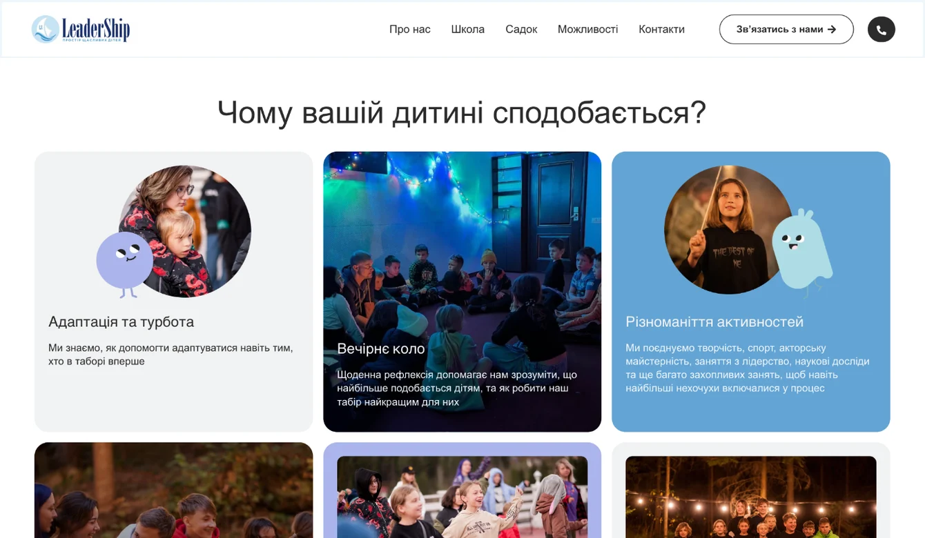
![Camps page on the LeaderShip website: cards with characters, photos and a blue badge]()
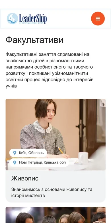
![Electives on mobile: a card with a photo and location tags]()
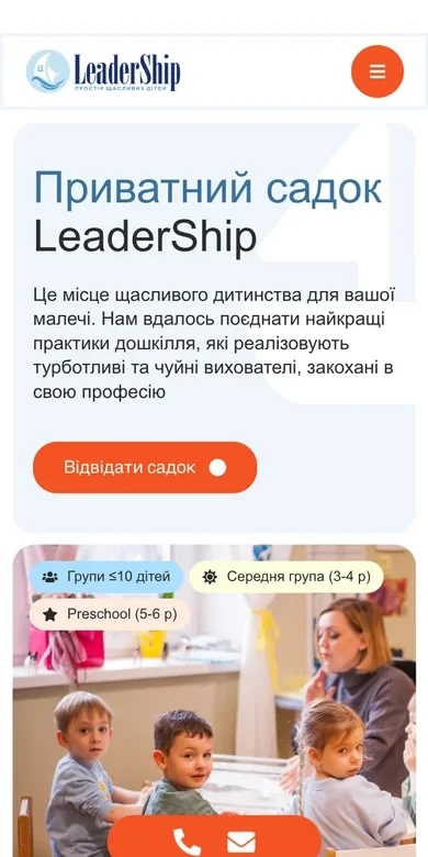
![First screen of the Kindergarten page on mobile]()
Kindergarten ![Blue card with a character on the Camps page on mobile]()
Camps ![Electives with location tags on mobile]()
Opportunities -
06
Build
Only now do I build the site on WordPress in Elementor (a builder that makes it easy to edit the site without a developer) from the mockups. Three areas, the parents' form, news and contact buttons are already inside.
Who does what
- You: get a link to the working version of the site and see how everything looks.
- Me: build all the pages, the parents' form, the news section and contact buttons.
- Deliverable: a working site where you can already leave an enquiry.
![The About block on the built LeaderShip website]()
- 3areas
- 12menu items
- 5contact buttons
-
07
Testing and launch
I check on desktop and mobile and send a test enquiry. Launch only after that.
Who does what
- You: review the result and give the go-ahead to launch.
- Me: check every page, every button and the form.
- Deliverable: a launched website.
- On desktop
- On mobile
- Every page and every button
- Test enquiry from the form
- Launch





SolutionWhat's inside
You can get in touch from anywhere
Parents fill in
The school gets it in Telegram
Sample enquiry, data is made up.
Opens from anywhere
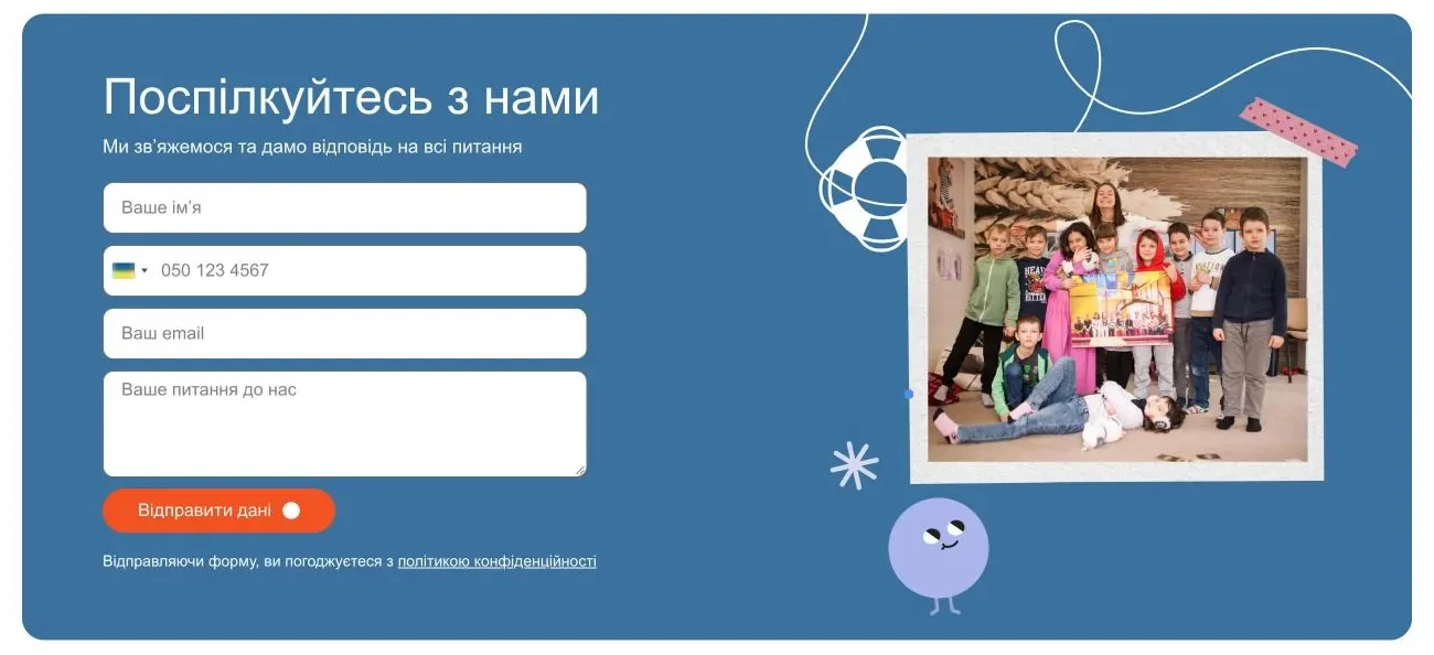
The “Talk to us” form sits on every page: home, kindergarten, contacts and careers. Buttons across the site open it in a pop-up, and most enquiries come through it. On the homepage the form has four fields: name, phone with a country flag, email and question.
- Contact us
- Visit the school
- Visit the kindergarten
- Get info
- Join the team
Enquiries go straight to Telegram
I set up the form so every enquiry goes straight to the school's Telegram: name, phone, question and the page it was sent from. The school runs no ads, so all enquiries come from the site itself. In a year and a half, the site's forms brought in more than 130 enquiries.
- Telegram
- Enquiry page
- Date and time
Careers with a CV
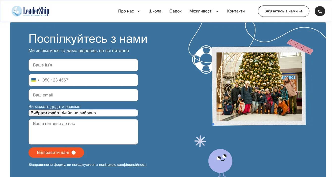
The “Careers” page lists three vacancies. At first only the titles show; I tucked the full description under a “Learn more” button. A CV can be attached right to the application.
- Mentor
- Ukrainian language and literature teacher
- Deputy head of school
- CV with the application
- Three areas from the first scroll
- Right below the first screen there are three cards: school, kindergarten, camps. Each shows the class or group size or age, a location tag and a “Learn more” button.
- Answers to worries
- “What about air-raid alerts?”, “What if the power goes out?”, “What if it's online again?”. Three short answers sit right next to the story about the school.
- Trial week
- An orange “I want to try a trial week” card sits right next to the answers. The next step is visible without searching.
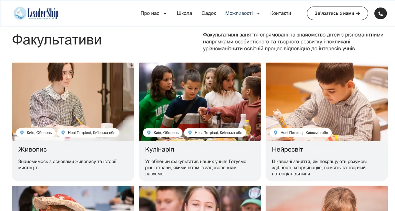
- Electives with tags
- Nine electives on one page. Next to each I added tags for the locations where it runs.
![Electives with location tags on the LeaderShip website]()
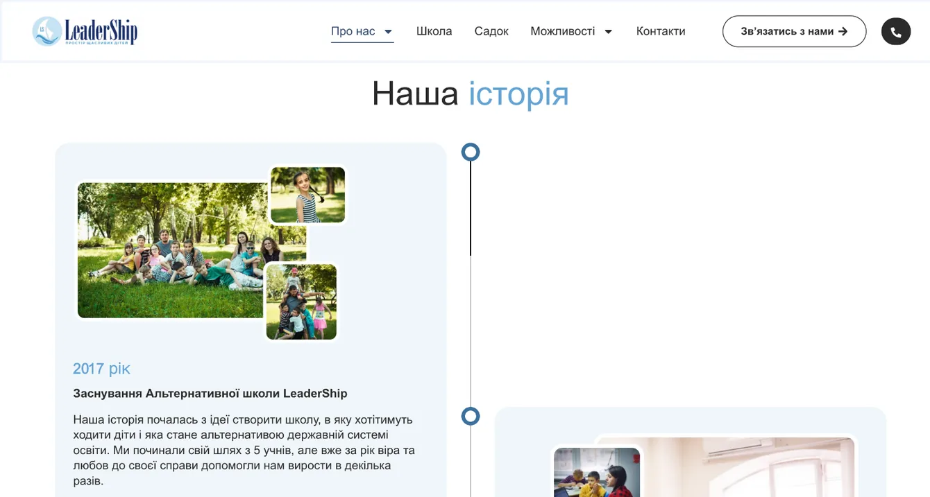
- History by year
- I presented the school's history as a timeline: 2017, 2019, 2021, 2022. The school's journey is clear in a few seconds.
![LeaderShip school history as a timeline by year]()
- Reviews and news
- Parents' Google reviews with stars and school news with dates. The site feels alive.
Three versionsPhone, tablet and desktop
Adapted for every device
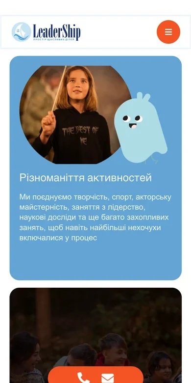
A separate phone version: everything in one column, large text, the form can be filled in with one finger. The tablet gets its own grid, halfway between phone and desktop.
- Menu under a round orange button with three lines
- “Visit the school” button and contact icons right on the first screen
- Area cards stack one under another, tags stay on the photos
- Tablet: the header has the menu and a “Contact us” button, below the text there's a button and contact icons
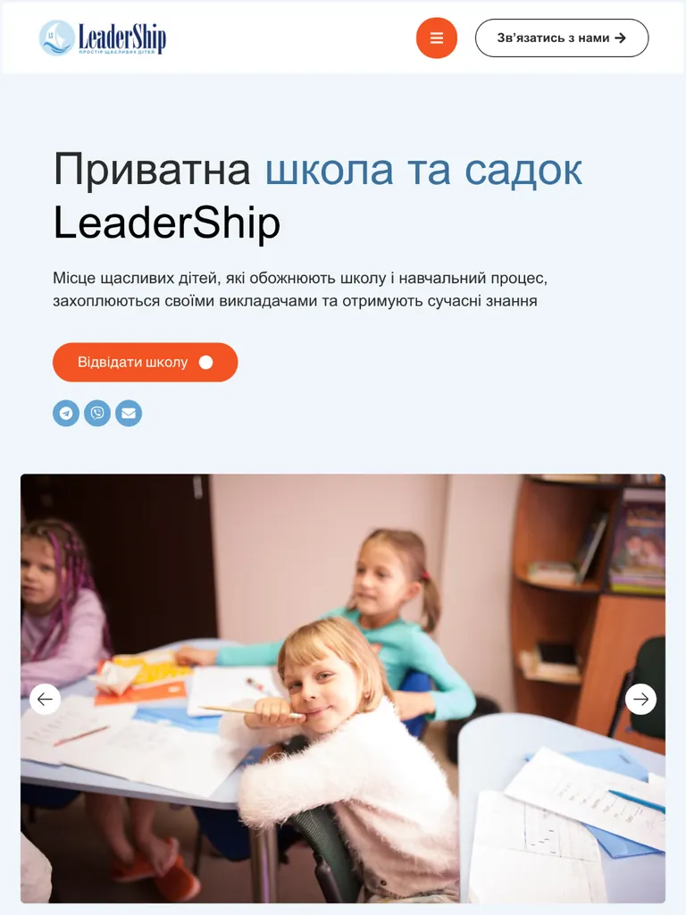

How the site looks on a phone. Scroll the screen and tap “Visit the school” to open the form.


Need a website for your business too?
Tell me about your project. I'll start with a conversation, not with design, just like here.